
Introduction
Early in 2013, I took on a client in need of help with a mobile solution that was currently in production. There was a long, growing, list of bugs and feature requests that needed some attention. After an initial set of "quick win" bug fixes, a closer examination of the application showed that all of the complaints and most of the bugs revolved around a user experience in need of improvement. In this article, I'll talk about a few of the things we focused on to begin turning things around for the users of this mobile application.
Background
Before getting into the solution, lets take a quick look at the original versions and review some of the issues.
This client, a SaaS company, built a work order processing system used by technicians to keep track of, and perform maintenance tasks on energy-related hardware in buildings. For example, a Dishwasher in the 3rd Floor Kitchen may need its drive chain inspected on a monthly basis. This work order would automatically be scheduled and routed to the appropriate technician. From there, the work order can be managed by the technician from his/her mobile device.
Initial Stack
Because of the need to run on both iOS and Android, the initial version was implemented as a hybrid application using Apache Cordova and jQuery Mobile. Plugins from both communities were used to handle things like scrolling, barcode scanning, etc. All things being equal, this stack works well for many applications.
Top Issues
Unfortunately, there were some design/implementation choices as well as some business requirements that negated some of the benefits of this particular hybrid approach. At the top of issues list were the following:
- Scrolling was unreliable on many Android devices.
- Overall performance suffered due to the chatty nature of the app and the need to keep re-rendering screens in order to keep the DOM's size to a minimum.
- There was not a consistent theme to the UI due to the mix of plugins used to resolve some requirements.
- Planned features, while possible with the current stack, were proving to be more and more time consuming to implement.
There were lots of other, more specific, bugs and feature requests, but most of the complaints were related in one way or another to these issues. With enough time and some very clever tricks/hacks, the first three items in that list could be reasonably resolved. The fourth item, however, would always be a challenge.
Constraints and Requirements
As with all projects, there are always constraints within which we must work. In this particular case, the following constraints and requirements were imposed for reasons beyond the scope of this article:
- The App must remain "familiar". While some retraining was expected, the overall "feel" of the app must be similar to the current implementation.
- Increase overall performance with a focus on resolving issues with scrolling, screen rendering and data reloading.
- Keep users informed of their work orders. The key here was to do this in a timely and convenient manner.
- Create a path to easily implement a growing list of features.
- While the backend services could be tweaked, a major overhaul was out of scope.
One additional thing to keep in mind is that this app, while available in the App/Play stores, is not targeted towards everyday users. Rather, it is meant to be used by service technicians working in properties that use the specific SaaS solution provided by this client.
Solution
For the solution, we decided to focus on the following 7 ways to improve the app's overall UX:
- Convert to a Near Native app
- Reduce Chattiness
- Build a consistent UI
- Take advantage of the "glance"
- Scroll less; Search/Filter/Sort more
- Smarter Push Notifications
- Let analytics drive each iteration
Let's take a look at each of these.
Convert to Near Native
Since issue #4 above had such a negative affect on the overall future of the app (which included any solutions to the previous issues), we decided to start there. The most radical change to the app was to move it from Hybrid to Near Native. While this was an expensive proposition, in this case, it would have been more expensive to continue down the original path.
We used Appcelerator's Titanium to build the new app so that we could take advantage of its impressive cross-platform features. This gave the app an instant performance boost across both iOS and Android. It also set us up to easily tackle the remaining core issues.
Converting to native can improve your {#}UX.
What the user got here was a much more responsive and fluid application that felt like it belonged on their device; no uncanny valley issues here.
Reduce Chattiness
A major cause of frustration and performance issues in the app were the repeated server calls for the same or similar data. Normally, these repeated calls are made because they represent an "easy path" solution to a common problem. For example, say you have a list of orders in one view which transitions to an order detail view when an item in the list is selected. If the user is allowed to make changes to the details, it is often easier to simply refresh the entire list from the server in order to reflect that change back to the list.
Obviously this is not ideal and there are lots of solutions to this problem. We chose to use the observer pattern
We were also able to take advantage of the fact that most of the work order related data is "owned" by a technician once accepted. This allowed us to maximize the offline use of the data until it is transitioned to a state that requires public access once again. Much of the supporting data (assets, locations, etc) changed infrequently enough to be used in an offline state upwards of 95% of the time.
For the user, this meant extremely performant screen renders and transitions. It also created a much better experience for those who worked in areas with limited connectivity.
Boost your {#}Mobile {#}UX by adding offline capabilities to your {#}app.
Build a consistent UI
Another area we found to be a source of confusion was the lack of a unified design language across the entire UI. Sometimes the culprit was the collection of plugins used the build out certain screens. In other cases, some views seemed to have been designed and developed with very little knowledge of the design language used in others. This created a somewhat chaotic experience for the user.
Agile's natural allowance for rapid and frequent course corrections gave us the ability to quickly iterate through the UI design until the right design language presented itself. We simply started with the home view (one of the most used views in the app) and implemented a new design. As we included additional views, the previous set of views would be iterated upon if the current view required some design language changes.
A consistent {#}UI increases your {#}mobile {#}app's {#}UX.
What users would experience here were views that got out of the way; leaving them to focus on their current context rather than having to understand how to interact with a particular view.
Take advantage of the "glance"
While working on UI consistency, we also worked on removing as much clutter as possible. For lists, we reduced the amount of information in each row so that there was just enough for the user to identify the item being presented. This gave the user more rows to choose from while making each row more understandable in less time.
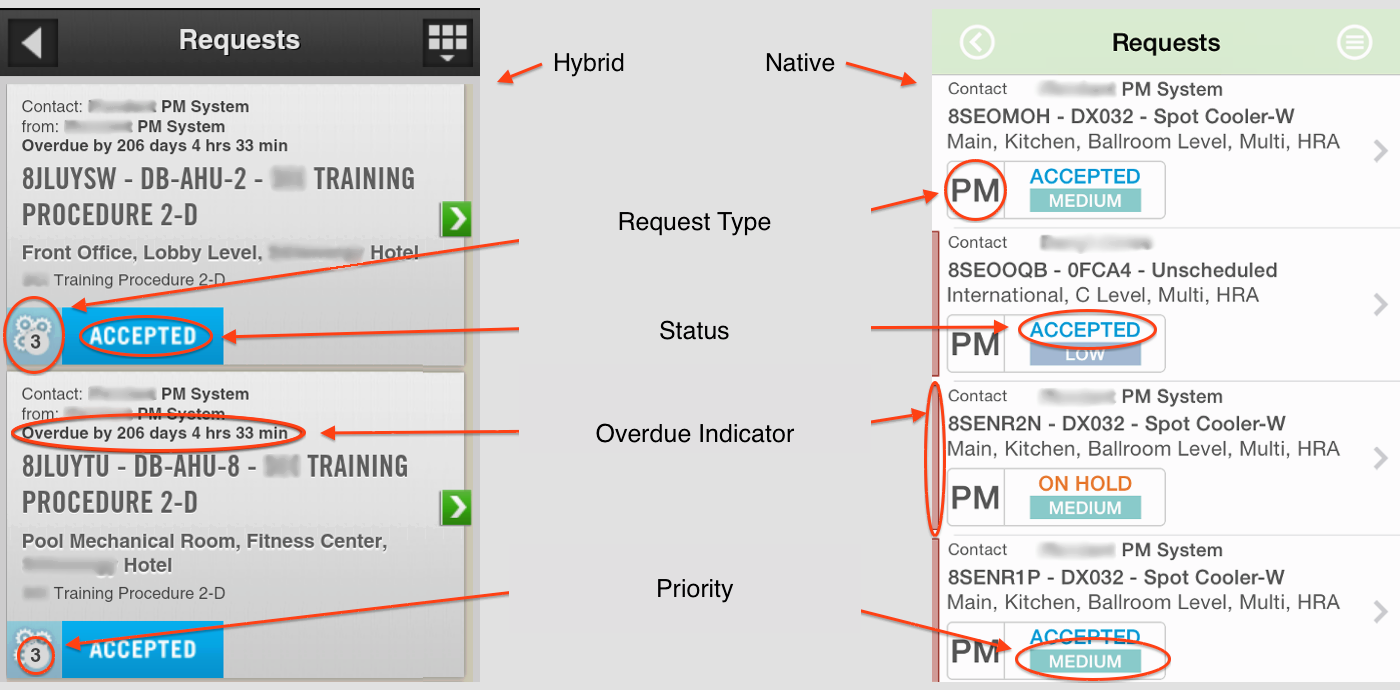
The above image is an example of the request list from both versions of the app. In addition to showing twice as many requests in the native version, we made an additional 3 of the 4 most important bits of information glance-able ("status" already stood out in the original app).
For this and all views, we worked on streamlining the presented data. We focused on answering the following two questions in order to determine what to display, when to display it, and how it should be presented:
- Is this item absolutely needed on this view?
- If so, can we (and should we) present it with a visual clue rather than purely as text?
{#}UX Tip: Stop forcing users to “read” your {#}Mobile {#}UI.
This resulted in a UI where late items or high priority items could be quickly identified with a glance; as opposed to having the user "read" everything.
Scroll less; Search/Filter/Sort more
Scrolling through hundreds or thousands of records has never been the best way to find something. Imagine a reference book written as one very long page. Finding something in the "M" section would be tedious. We've moved away from this practice with most things. Books provide a table of contents and an index, tapes have taken a back seat to direct access media, etc.
The "Scrollable UI," however, has remained as one of the primary ways of presenting long lists. They are relatively easy to develop, but present usability issues for our customers.
While we didn't removed them completely from the app, we limited them to somewhere between 50 and 200 records depending on the data being listed. We then augmented those lists with full text searches, filters and sorters. The idea was to guide users towards looking up their data and managing the results rather than "flicking" through a very long dataset. We also provided cross-referenced data to further reduce scrolling. For example, a user viewing a piece of equipment in a building can go directly to the work orders for that asset with the tap of a button.
For a better {#}mobile {#}UX, Scroll less; Filter/Search/Sort more.
So far, this has worked out nicely. Users are usually able to get within 10-20 records of their desired item. Since these particular users tend to be familiar with the data, many of them are specific enough in their searches to produce results that are one or two records long.
Using native components made the lists (and everything else) extremely fast by default. With these augmentations however, users get to their data in even less time.
Smarter Push Notifications
Because of their time-sensitive nature, users need to be informed when a new work order has been assigned to them. In the initial version of the app, Comet was used to push alerts to the user's device. This was problematic because it would only work while the app was front and center.
One of the quick wins came from adding Push Notifications. However, due to some technical issues with the early app, these notifications were very basic and did nothing more than launch the app when activated.
Focus on {#}UX when implementing {#}Push {#}Notifications.
In the redesign, we focused on smarter use of Push Notifications so that data is preloaded before alerting the user in many cases. The user is taken directly to the appropriate view when reacting to a notification rather than simply being dropped onto the home screen.
Naturally, Push Notifications provide a great way to keep users engaged. However, properly designed notifications can go a long way to improving the overall user experience as well.
Let analytics drive each iteration
We took some risks by implementing some of the solutions above. In some cases, we changed how the user interacted with the app (as with our list modifications). At the end of the day, there is no absolute way of knowing how well these changes will be received before the app has been delivered. What we can do however, is track what happens after delivery.
Improve your {#}mobile {#}UX via repeated analytics-based adjustments.
Because we used an agile process with a plan to release often, we can rely on analytics to let us know what we got right and what needs adjusting. What better way is there to increase user experience than having the users themselves tell you? So we track everything we can think of and we use this data as part of the planning process for the next release. We then repeat the process after that.
Conclusion
With all of this, a framework has been put in place that is flexible enough to accommodate future requirements. More importantly, the overall process for the continued development was change to one that focuses first on the user's experience. The reception has been great. The app is not perfect, but there has been a notable turnaround in how the users interact with it and how they feel about that interaction. To quote one user:
The most recent update is head and shoulders above the previous versions...Lots of small quality of life fixes...No doubt big improvement.
What say you? Have you used any of the above tips in the past? How do you keep UX at the forefront while building your apps? Sound off in the comments below.